Showing posts with label Artists. Show all posts

14 March 2012

Eric Nash

I can't copy most of these images. Unfortunate. Here's a little preview though:


Go and have a look, they're pretty great:

          via ericnashart.com

                    via Stephen Archdeacon Gallery

06 March 2012

Fuel/Friends blog, Gregory Blackstock, Jack White's "Blunderbuss," oh my!

Tonight has been (entirely by chance) the first time I've visited her blog in probably months, and she's posted about birds this very day. Whattt.
If you're a music lover and not familiar with the blog, go explore and discover!

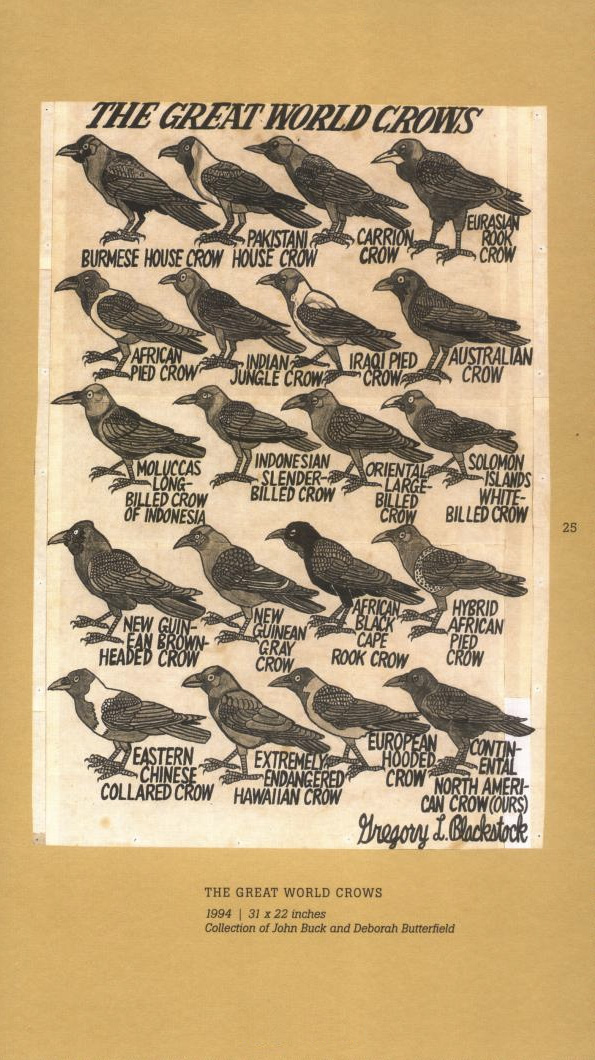
And along with avian related music, she's linked to avian related art by autistic savant Gregory Blackstock, who created this gem:


          via I am Fuel, you are Friends

                    via The Atlantic

 And then (are you serious!?), seconds later, I find this: the cover to Jack White's solo album Blunderbuss, due to release in April. Everything the man has done to this date has been such a huge influence on what appeals to me aesthetically. Needless to say, the album is much anticipated. Check out the single below.


Jack White, Love Interruption

05 March 2012

Emma Kisiel

A really good friend of mine from our MICA days - it's been quite a while, but she's totally awesome. All of her work is great, but her latest work strikes more resonant chords with me. It's no secret how I feel about textures and repetitions, and I love the many ways they work in these photos. Go look at them!
No one I know makes death feel more alive, or more sacred.


from Down To Sleep, 2011


from At Rest, 2011


          via balticphotography.com

                    via baltic blog

All images are property of the artist.

28 February 2012

Arthur Rackham

Trees and plant life, crows, and patterns... what more could I ask for?

Illustrations from Peter Pan in Kensington Gardens:


More here.

02 September 2011

The Silent Giants

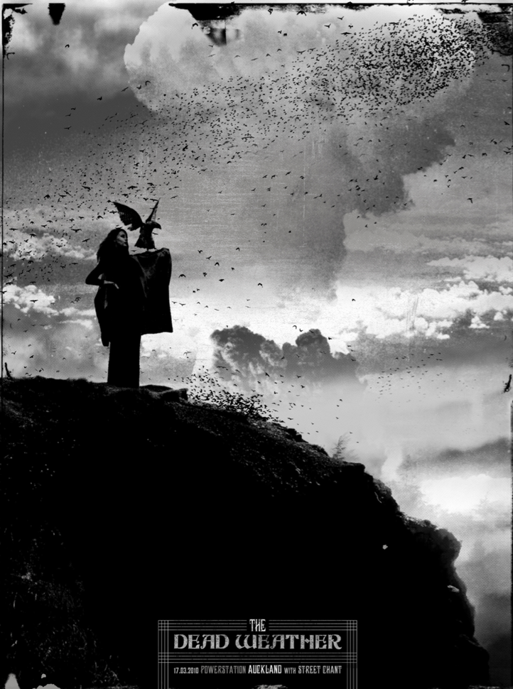
So, today I found out about these designers who are the geniuses responsible for all of the Dead Weather summer tour posters that I have been drooling over since last year. And better yet, it seems that nearly all of their products are equally desirable (see: Iron & Wine and Bright Eyes posters shown below). When I say, "I really identify with their aesthetic," I generally mean, "I'm addicted to black birds and trees."
Kudos, my friends! Want to give me a job?

Find them at their site here: The Silent Giants


(P.s. - Nice cameo by The Head and the Heart on that Iron & Wine poster. Love them!)

08 June 2011

Chris Russo

This is a really awesome woodcut by a friend of mine at Pratt. Check his stuff out!

via the artist's blog, Don't Panic

21 March 2011

Brad Kunkle

These really lovely paintings are embellished with real gold and silver leaf, so the reflections of light change the image as you move (see the artist's website for details). Beyond that, I'm more interested in the repetitive use of the leaf and grass forms to create fluttering texture fields.

Brad Kunkle, Eidolon
Brad Kunkle, Windhandel
Brad Kunkle, The Proposition
Brad Kunkle, Summoning a Sleeper

via Brad Kunkle
        via Artist a Day

13 March 2011

Armin Mersmann

This drawing caught my eye over the rest of the artist's work. I find it very closely related to what I'm doing lately, including the tree roots, black bird, graphite texture, and narrative qualities.
It's super awesome!

Armin Mersmann, Stripped, Graphite on board, 2007

via Armin Mersmann
          via Artist a Day

28 January 2011

Stephanie Kunze

I saw this drawing on Fox 2 yesterday. I don't think I'm really exaggerating in saying that it's probably one of my favorite drawings that I've seen come out of MICA in 3 1/2 years. It reminds me of Seurat's drawings in its really subtle tonality, and variations in focus. I like the sort of ambiguous narrative, where you're not sure what the subject is grasping at, or if she grabbed a bubble that has just popped; that fleeting impermanence is great. Additionally I think the treatment of materials and textures is really incredibly delicate. It gives you the initial impression of a print or photo, and sort of wavers as you come closer and try to discover whether the lack of focus is your eyes or the image. While the really beautiful fields of graphite texture become apparent close up, the wavering focus that make the image really interesting never leave. Check it out while you have a chance!

Kudos Stephanie!


via Stephanie Kunze - Illustration

23 December 2010

Nora Sturges

I'm trying to start catching up with posts about the wealth of artists I've been looking up lately.
This is the work of Nora Sturges, recommended to me by MICA professor Michael Weiss, based on my Allegory of Home #2 drawing, and my interest in the vast, surreal, and narrative landscape. I love her work, and there is a ton of it. She has an interesting narrative series about the explorer Marco Polo, which has a similar feel to what I'm trying to do with my self-portrait drawings: sort of taking a single character on a journey, which in my case illustrates my personal experience.
These images and many more on the artist's website.


At the End of Five Days' Journey, You Begin to Discover a Few Towns Built Upon Rocky Heights
Development
You Traverse a Country that is Destitute of Every Sign of Habitation, the People Having All Fled
Platform

29 December 2009

Victorian Aestheticism

Researching for a paper on artist Frederic Leighton introduced me to a great book:
"Art for Art's Sake: Aestheticism in Victorian Painting" by Elizabeth Prettejohn.


The book includes essays on a number of Victorian painters, some of the first to express aesthetic values, and the formative characters of the Aesthetic movement, including Frederic Lord Leighton, Albert Moore, Dante Gabriel Rossetti, and James Abbott McNeill Whistler. The essays talk about each painter in the way that his work specifically addresses aesthetic concerns, or diverts from the academic traditions of the day, and the realism of Pre-Raphaelite painting. For anyone like myself, with an interest in 19th century Aestheticism, or even 19th century art in general, this book will be an interesting and educational read.

The essay on Frederic Leighton is really interesting for explaining his background, association with the Royal Academy in London, and the way he creates a relationship between his academic working process and aesthetic ideals. The book also gave me my first real introduction to the work of Albert Moore, whose paintings utilize repetition, rhythm, and other musical ideas in visual form, which parallel the symphonic references of Whistler. The information on his use of repetition as a compositional device was unexpectedly relevant to my own taste and ways of thinking about organizing an image and controlling the gaze of the viewer.

Frederic Leighton:


Pavonia, 1858


 Icarus and Daedalus, 1869


Albert Moore:


Dreamers, 1879-82


The Quartet,1868


Apples, 1875

24 August 2009

Alex Kanevsky

A contemporary painter dealing in beautifully textured works in oil, primarily figurative but also relating to a few series. The paintings are a very interesting hybrid with similarities to Francis Bacon, Euan Uglow, and Odd Nerdrum. Bacon for their psychological weight, and the figures' interaction with the bed, chair, and bathroom; Uglow for their often fragmented and planar painting style; and Nerdrum for the repetition of figures, their cloak-like covering, and the compositional arrangement of portraits. Kanevsky seems to favor a near square format, which he handles effectively in his composition.
Images from the artist's website.


Kanevsky's paintings have a very fresh feel, which he states (in an interview) is his aim. He achieves this effect with continued reworking in which he attempts to hit his mark in one shot, and if he fails, he waits for the paint to dry and tries again. The artist has a very interesting section on his website where this process can be seen, something I've always wanted to do myself but never did. He also has a great list of links to get you searching around. It is a recommended stop for fans or fellow painters searching the web.

20 August 2009

Rosy Lamb

A painter/sculptor in Paris, using primarily plaster and oil paints. I like the effect the plaster surface has on the paintings, and she does some really interesting things with plaster frame imprints. I'm also a fan of the "unfinished" finish of some of the portraits. Although I think that relates to time constraints, it's still a good exercise in decision making and painting economy.
More of her work here.


The project she worked on called The Sleeping Author Project sounds really fun, and similar in certain ways to the portrait project I was developing. While Lamb's paintings attempted to capture the subject (a stranger) within an hour of their personal introspection or dreaming, I would want my time to be unrestrained. My painting would aim to be the physical and visual record of that time spent in the presence of the sitter (a strong personal relation or acquaintance). The process would also involve good decision making, editing, and painting economy. I anticipate my most difficult and frustrating obstacle to be the time necessary for my subjects to spend in my presence. Time is always seen as valuable and precious, something to be held onto rather than given away. Though I'd like to think my sitters would take something away from the experience on a personal level. We shall see.

19 August 2009

Bruce Yardley

Images from The Catto Gallery.

This guy is a great painter of light. I'm not always one for landscape painting, but the composition and light effects of these are beautiful.


The shaded buildings in the background, harsh light and cast shadows of the tables and chairs here are incredibly well observed.


A great use of sun and shade to really create and fill a space with light and atmosphere.


More here.